In parts 1 and 2 of this series, I covered:
- How many typefaces should you use?
- A fantastic rule for choosing typefaces
- Accessibility and why that comes first
- Line height
- Line length
- Alignment
- Letter spacing
Check it out if you haven't already, Part 1. Here is Part 2.
1.) Get to know five fonts well, over 50 fonts a little
Less is more when it comes to most things, and certainly when it comes to type. Knowing something like 5-7 fonts well will help you greatly, and you will learn a lot about typography. By focusing on a few, your knowledge will increase by learning the quirks of a few set fonts.
2.) Vertical Rhythm
Vertical rhythm is hard to get right on a site with lots of content. It's difficult for Squarespace designers in the UK because just one image is out of perspective, and you can say goodbye to vertical rhythm. I suggest making your type consistent throughout your site rather than aiming for the utopian dream of vertical rhythm on your Squarespace sites.
3.) Don't completely dismiss default fonts
Default fonts such as Georgia, Arial, Verdana and Times New Roman shouldn't be completely dismissed. They can work well in some designs. The two main advantages of them are: 1 - They will already be installed on the user's computer, so no downloading of the fonts is necessary - this helps with web performance. Secondly, these typefaces have been thoroughly tested and consistently work well across all browsers.
4.) Harsh colours
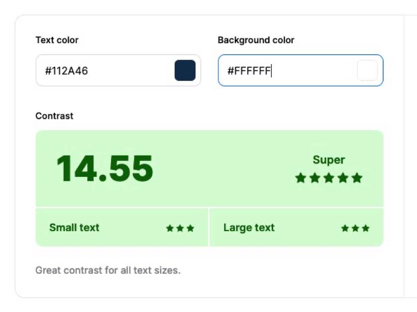
In part 1, I mentioned accessibility and having a good contrast with your text colour and backgrounds. I should have mentioned you can get too into the contrast ratio and set black text on a white background, which is the maximum amount possible. I'd go quite close to black but add in some brand colour. So, in your colour wheel, move off black and a little into red if your brand is red-based in colour.
5.) Alignment
It's effortless in Squarespace to drag things with indents and have elements misaligned. In most sites, you want a hard left-hand edge in which you set all your images, headings and paragraphs. You will see a small animation in the YouTube video above, in which the correct alignment makes perfect sense.

6.) What's important?
We have discussed various aspects of typography, including typefaces and related elements. All this has to have a goal, though. The goal is to have legible and readable words. Gorgeous comes AFTER having an easy-to-read and comprehended type. If your type of work is not readable, you have failed. Sure, we are gorgeous type, but legibility comes first. It's a matter of priorities. The most beautiful set typography in the world means nothing if it's not easy to read. Easy on the eye comes second after legible text.
I hope these tips have helped you with your Squarespace builds; please leave any comments on the YouTube video.
Last updated:
Written by John Macpherson