In Part 1, I covered using colour and background gradients, as well as rounded corners, to differentiate my design from other Squarespace designs. Please check out Part 1 if you haven't seen it yet.
1.) Get away from common pattern
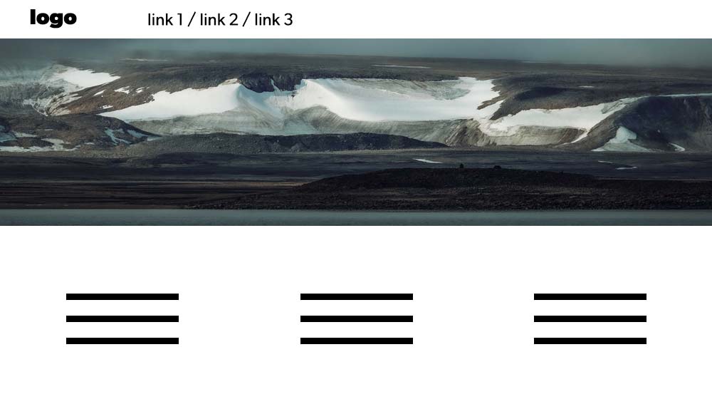
I'm sure you have all seen this design pattern over and over. You have the logo on the top left, along with the navigation in a white bar. Below that, you have the hero image at the full width of the screen. Then you have the tired design pattern of 3 columns, either with icons and or text. It's swept the web over the last few years, and I'll just say it: it's lazy design. There are so many options when designing a website; this is one of the almost unlimited designs you could come up with. These common design patterns are almost like a self-fulfilling prophecy by seeing them over, and your thinking is conditioned to believe it's a good design just because you see it so much. Then, more designs are created, and it spirals out of control. There is so much more to Squarespace web design UK than this. In a way, however, having so many people design like this is a positive; with so many going in this direction, it gives you an opportunity to go in a different direction.

2.) Video
Video can bring a website and brand to life. If you get the opportunity to use video on your site, do it. Many sites don't utilise it, so you can get ahead. With the cost of storage and everyone owning a smartphone now, budget shouldn't be so much of a problem. I will say, though, that you need high-quality footage; the client's nephew in primary school, who got the last iPhone for Christmas, is unlikely to provide the high-quality footage needed. If you can get your hands on high-quality footage, then grasp that opportunity with both hands. Putting videos online with Squarespace is very easy now. A little tip: if budget is an issue, look towards students looking for portfolio pieces. They will be glad of 'beer money', and many are skilled videographers. Video can differentiate your Squarespace sites from others; use it if you can.
3.) Typography
There are a lot of typography options available to designers. Please check out the short series on typography I did, starting here. These are the fundamentals; using them alongside some of the innovative HTML and CSS techniques can create great results. Using text on your Squarespace like a mask is something few sites do. Another option is to use an outline stroke; here is a YouTube video demonstrating that. That's two techniques that will differentiate your Squarespace sites from other websites.

There will be a further two parts of this short series. Please leave a comment on the YouTube video page.

