In part one, I covered using colour and background gradients and rounded corners to differentiate from other Squarespace designs. Please check out part 1 if you have yet to see it. Part two covered getting away from overused design patterns, video and typography. Check part 2 out as well if you haven’t seen it. In part 3, I looked into photography, design style and looking outside the box. These lead to this final part.
1.) Illustration
High-quality illustrations can make you stand out from your competition. These three examples show how much personality they have compared to your typical image of a girl looking at a computer. Peter Voth is the creator of the line-drawn landscape. Absolutely stunning for the right project.

2.) 3D
The world is your oyster when it comes to 3D. Using a Javascript library like Three.js allows you to create whole worlds, all within a web browser. There is a learning curve to this, but it’s not as complicated as you may think. I took a fabulous course called 3D Journey by Bruno Simon a few years back. There is no affiliate link; I’m just a happy student of the course and can vouch for it. If you can write some basic Javascript and CSS, it may surprise you how far you can get with the course. While not for code newbies, Bruno explains how to get up and running well.
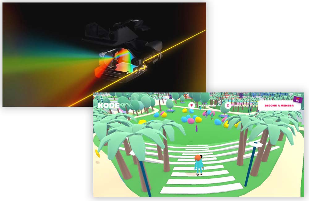
In the first example, browse through the Polaroid mini-site. They have built the camera in 3D and animated it to significant effect. It’s a stunning site and may take someone a while to make themselves, but it’s certainly possible!
In the second example, I delve into the 3D world of Kode Sports Club. It’s an immersive 3D world powered again by Three.js. It is a stunning experience where you can roam as you please. Once you get up and running with Three.js, something like this is a lot easier to create than you think, and you could add it to a Squarespace UK site quite easily.

3.) Copywriting
I have left this for last in this mini-series. Copywriting is critical to successful web design. Many designers throw the content at words at the end of the project, almost like an afterthought. I know; I used to do it myself.

We need to get back to why we are creating websites; most situations will be to give the client a great return on their investment. In short, you are making much money for them, and more than what they paid you. 10x is a good figure. To maximise the success of any web design project and Squarespace project, the words on the site must resonate and sell to the prospect. Our Coffee Squarespace template showcases this.
I will leave you this: You can have the most beautiful website in the world, but with the wrong words, you won’t sell a thing. You can also have an ugly website, and with the right words, you will sell a ton.

