In part one, I covered using colour and background gradients and rounded corners to differentiate from other Squarespace designs. Please check out part 1 if you have yet to see it. Part two covered getting away from an overused design pattern, video and typography. Check part 2 out as well if you still need to see it.
1.) Photography
As a designer, working with great photos is like giving a craftsman the best tools to work with. Spend as much of your budget as you can on a good photographer. As a Squarespace designer, It will really pay off, and with a catalogue of images, you, the designer, can use them beyond this project and all future projects going forward.

2.) Style
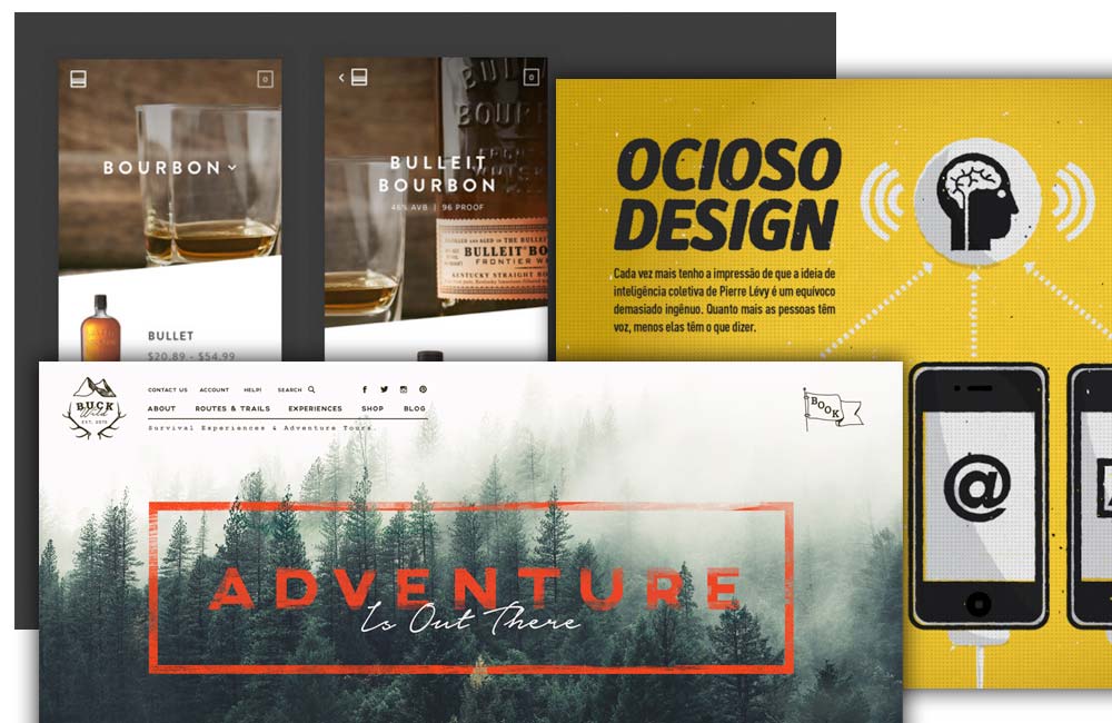
There are hundreds, if not thousands, of unique styles you could use in your websites. Some of them may be similar, but many are different. In this video, there is a whisky brand that has a diagonal slant through the photos. This adds something different and not commonly seen. It seems too straightforward to include this, but any designer is straight across from left to right. With a slight but distinctive design pattern, I'd follow this right through the website, not just on the header images. The second example has an illustrated vector pattern but a slightly rough squared pattern sitting on top. It works well; as you guessed, it's different from 95% of websites out there. This is such a unique style, and it works well in this design.

3.) Outwith the box
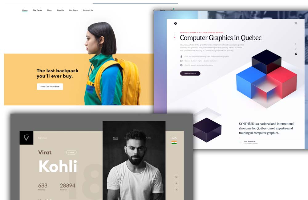
As a human, the most natural way to layout designs is to have everything contained within the edges. That's because, over the years, most things we view in everyday life and design are that way. Don't ask me any more! As designers mature, we learn that great design can happen by going beyond constrained boundaries. It only suits some designs, but these examples show some good designs out of the box.

There will be a further part covering more ways to differentiate yourself as a Squarespace designer.
Please leave a comment on the YouTube page if you want to discuss anything.

