In part 1 of this series, I covered:
- How many typefaces should you use?
- An excellent rule for choosing typefaces
- Accessibility and why that comes first
Check the typography video part 1 out if you haven't already.
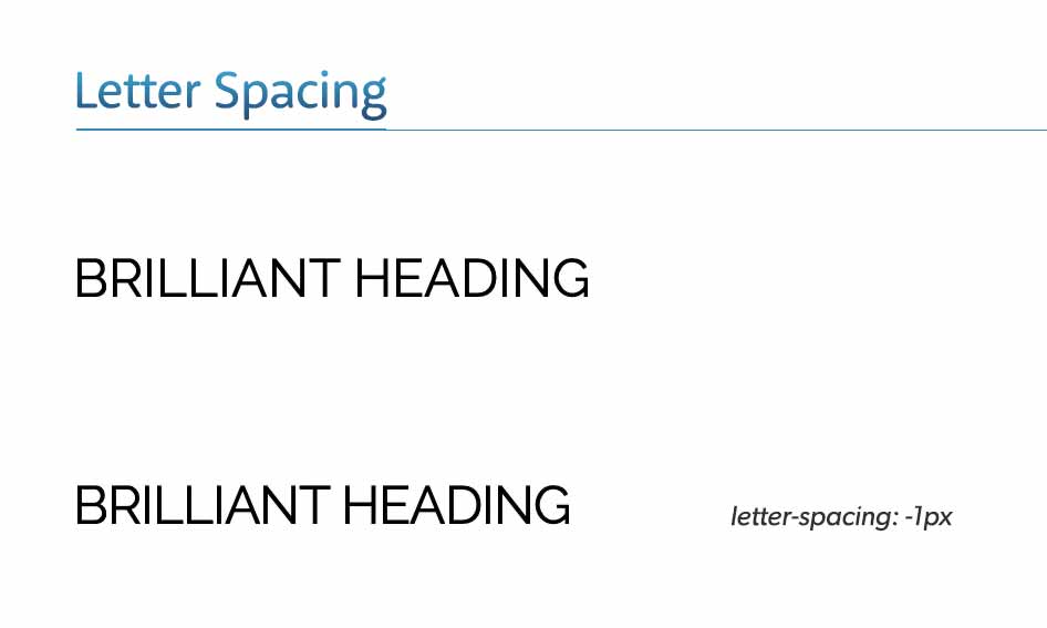
1.) Letter spacing and tracking
Letter spacing isn't something you usually need to touch, as the typographer sets the defaults and has been well-tested and thought about when they were designing the font. That said, it's certainly an option for you to experiment with. Letter spacing is the CSS value; in typography, it's known as tracking. Nudging the letters closer together can make a big difference to the feel of the type. You would only really adjust letter spacing on headlines, not body copy such as paragraphs. It's very, very rare to change the body copy's letter spacing, but some Squarespace designs do.
2.) Line height and leading
Technically known as leading in traditional type talk, it is an option that can make for a much better effect than letter spacing. Whilst letter spacing is only realistically set on headlines, line height can be set on headlines and body copy (paragraphs) with big effects to the readability of the text. On a headline, you may set it to about 1.2. Your mileage may vary depending on what typeface you are working with, but 1.2 is a good figure to rely on. Our Squarespace Coffee Shop template shows this.
In the body copy, 1.5 is initially a solid figure to set and see what it brings. Again, it depends on what typeface you are working with. You may find that 1.3 works, and you may find that 1.7 works. My personal preference is for open text, and I tend to rate it around 1.65 on some sites.

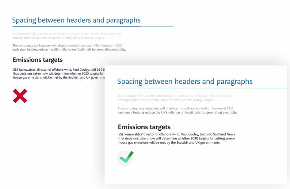
3.) Spacing between headlines and body copy
In the first example below, the first "Emissions targets" is halfway between the surrounding paragraphs. This makes for a design in which no relationship is established between the paragraphs above or below. Giving more space above the headline creates a better relationship, as the headline should describe the content immediately below it and not above it. I've mentioned it a few times now in this short video series, but there can be a lot to go wrong with typography, and to make things as simple and easy as possible is good advice. Therefore, it's not a bad guideline to say two parts about the headline and 1 part below. This established a good synergy between the headline and the following paragraph.
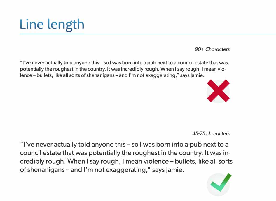
4.) Line length
Having the wrong line length is a common problem in web design. The line length is typically too long and not short enough. The issue is that with a long line length when the eye goes to the next line, you are not sure which line is the correct one to read. It is frustrating and tiring to read long scathes of text.
Ideal length
A good figure to aim for is 65 characters per line. The general advice is to have between 45 and 75, but there's too much away from me in that advice. 65 seems about right to me when I'm setting type with CSS.
@media only screen and (min-width: 1280px) {
 p{max-width: 900px;}
}
or
@media only screen and (min-width: 1280px) {
 p{font-size: 28px;}
}
Hope these tips have helped; please leave any comments on the YouTube page.
Last updated:
Written by John Macpherson