Sometimes you want to remove elements, images, content in Squarespace in mobile view and keep them in desktop view. This blog shows you exactly how to do that.
In this short blog I will show you how remove things in mobile view, but keep them in desktop view. I will also show the reverse of that - hiding elements in desktop and keeping them on mobile. It's something we use regularly in our premium Squarespace templates.
You may have a really large image in desktop view which is just too big to display on smaller devices such as mobiles. How do we go about sorting this?
In my recent introduction to Less in Squarespace I used reusable Media Queries and that’s what we are going to use here.
First we need to get the block ID. This is the unique identifier of our container. As Squarespace designers in the UK - this is completely unique to your site, they are different for every site.
We have 2 options to find the identifier of our block.
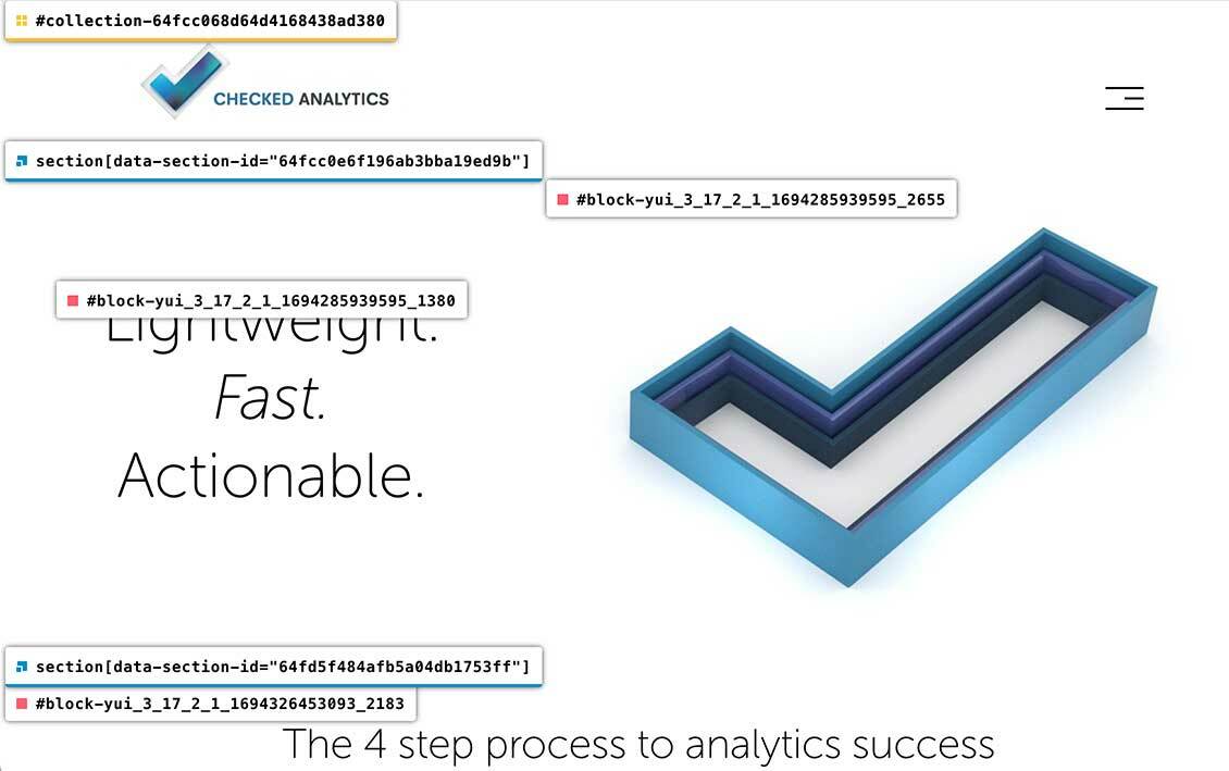
First a very handy Chrome Extension, seen in action below. Install this and click it on your site. You can then copy and paste this in to your Squarespace CSS.
The second option is to use your web browsers developer tools. This is more difficult to use than the Chrome plugin linked to above, but there is a lot of great things you can do with Dev tools.
Either you want to grab your unique block identifier.
In the below we hide that view from mobile
#block-yui_xxxxx_your-number-here{ display:none;}And we show it here
@tablet: ~"(min-width: 1024px)";

#block-yui_xxxxx_your-number-here{
@media @tablet {
Display:block;
}
}
So lets do the opposite - hide the element on desktop view and show it on mobile view
#block-yui_xxxxx_your-number-here{
@media @tablet {
Display:none;
}
}
That is saying, anything above 1024 pixels, hide the element by display property.
A short, straight forward blog post, today. I hope that helps, and if you have any questions don’t hesitate to contact me on X / Twitter.
Written by John Macpherson