This technique adds another level of quality to your Squarespace sites and improves user experience. With little code used and being incredibly easy to implement, it really can add a slick and smooth animation to your site.
The effect:
Why use this technique?
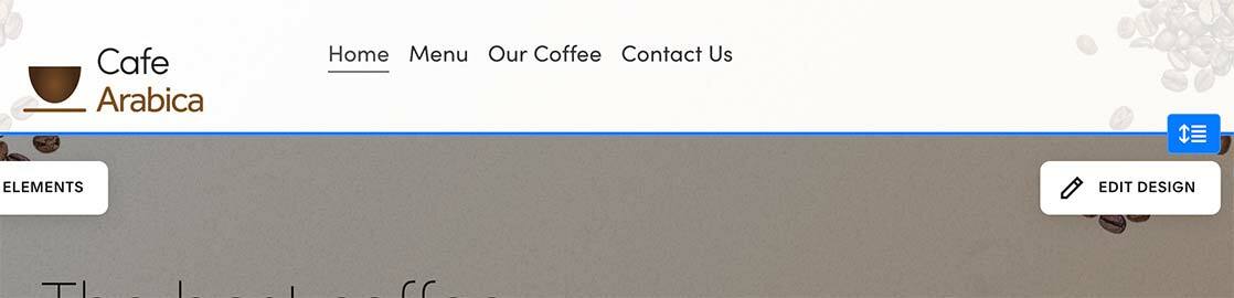
There are all sorts of tweaks we can do with websites…We in fact, use this on our Coffee Squarespace template. What is the benefit of using this?
- It increases the size of the interaction area the user has with the rest of the page, so better UX.
- This technique increases white space which makes for cleaner websites and a better visual aesthetic.
- There is little code used, so it doesn’t bloat pages.
- Works well with mobile with a tiny adjustment.
- Add a little polish - most sites are static and have no animation. This adds something different.
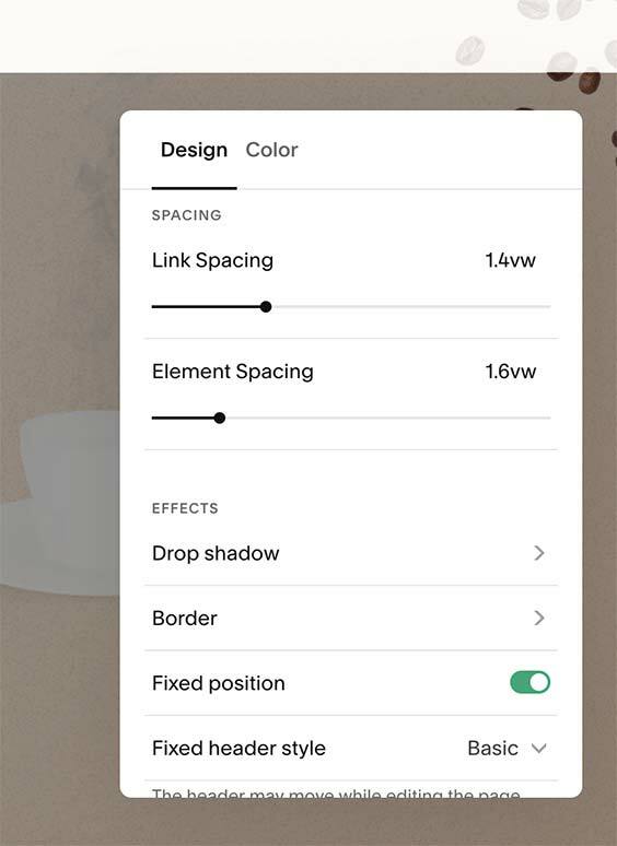
Step 1: Turn on Fixed Header Style in the header
Navigate to your Squarespace site, then choose Website > Pages and click on any page that uses a header. Hover over the header and click ”Edit Site Header” then Click “Edit Design” on the right-hand side.
Make sure “Fixed position” is selected and “Fixed Header Style” is set to “Basic”. Save.
Step 2: Add code.
#header {
 background-color:rgba(255,255,255,.85)!important;
}

#header .header-announcement-bar-wrapper{
 padding:1.5em 0;
}
#header img {
 margin-left:10px;
 margin-top:-14px;
 transition: height 300ms ease-in;
 height:60px;
}
#header.shrink {
 .header-announcement-bar-wrapper{
 padding:.75em 0;
}
 img {
 height: 60px;
 }
}
@media only screen and (min-width: 800px) {
 #header img {
 height:100px;
 margin-top:14px;
}
 #header.shrink .header-announcement-bar-wrapper{
 padding: 0;
}
} //ends media query
Optional and additional bonus - Full-width logo.
In the Squarespace forum, people were asking to have a very large logo, as Squarespace designers we thought it adequate and when scrolling starts animate that to the traditional logo position in the top.
For me, this doesn’t work particularly well in the Arabica site. It’s a little brutalist but there may be situations that you want to have this on your site.
If I were to have something like it, I’d look at the size of the logo and reduce it and also have little in the top section(the hero). There’s just a lot going on in the background for the example above to work well. For the sake of giving a working example though, the code should work with minimal adjustments.
Replace the code in step 2 above with:
#header {
 background-color:rgba(255,255,255,.85)!important;
}
#header img {
 height:60px;
 margin-top:-10px;
}

@media only screen and (min-width: 800px) {
#header img {
 transition: 300ms ease-in;
 height:auto;
 position: absolute;
 width:90vw;
 margin-top:-27px;
 left:0;

 }
#header.shrink img {
 width:100px;
}
} //ends media query
I hope you find the code useful and if you have any questions at all, don't be afraid to reach out to me on X/Twitter.
Written by John Macpherson