Tablet usage is well below the usage of mobile and desktop devices, but it still should be taken into consideration when designing sites. New device sizes with new sizes come into production use quickly, and no one knows which size will become popular. Apple could release a new-sized device tomorrow, and you would want your site to work well in it. It’s always a good idea to test your websites in as many different sizes and devices as possible, and building sites with Squarespace is no exception.
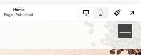
Squarespace used to have a tablet button in the admin. As Squarespace designers we loved this feature.Some of you may remember that besides the mobile and desktop buttons, there was a tablet button. It worked well, but unfortunately, in 2025, that tablet view is gone. I’m guessing that Squarespace wanted to keep things as simple as possible and felt the need to remove it.
There are occasions when you want to target only tablet devices, and that’s what this post covers.
So what is tablet size? The media queries for Squarespace are set from 768 to 1024px. So, how would we target those tablet devices in media queries?
@media (min-width: 768px) and (max-width: 1024px) {
 p {
 font-size: 1.2rem;
 }
}
Essentially, you are saying that between device sizes of 768 pixels wide and 1024 pixels wide, apply these styles.
How can we see that size in testing our Squarespace sites?
#1. If you right-click in Chrome and choose Inspect element, you go into Chrome Developer Tools. Resizing the window activates a sizing box. It disappears quite quickly, but it is quite handy.

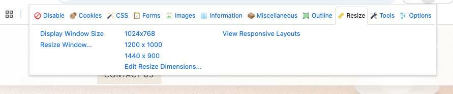
#2. In Chrome, there is an excellent extension called Developer Tools. You can set sizes in there to test. You can customise your own sizes, and it’s a really useful extension that has many more uses than just resizing your browser. As an example we saw when designing our Squarespace coffee template you can see the screenshot below with Developers Tools in action.
Additional information and links
Will Myers, an experienced Squarespace developer, has put together an interesting script to utilise and have a different media query for tablet devices. I haven’t personally used this, but I’m very much in the camp of running as few scripts, plugins, and additions to the browser or websites as possible. This could interfere with other elements of your Squarespace CSS. That said, it has gotten some positive feedback and, in the right situation, could be helpful and warrants a mention here.
Squarespace plugin, but it costs money
There is also a Squarespace plugin that actually adds a Tablet button back in the Squarespace UI. Just like there was natively in the Squarespace admin, before they removed it. This is a worthy addition to the platform. Unfortunately, it costs around $178 per year. I personally haven’t purchased this yet, not just for the price but as I like to keep a lean setup and this is another script that can interfere with other elements of Squarespace. It definitely warrants a mention here though and I’d love to hear your feedback if you do happen to use it.
Please feel free to comment and get in touch on Twitter/X.
Written by John Macpherson