I love the BBC site, which I visit for all general news and sports daily. It's updated by a gigantic number of staff and reporters, and the coverage is fair and balanced (most of the time). There is always something to watch on iPlayer, and across all media channels, BBC does things very well.
Some improvements could happen, though, and these are a few thoughts on making something that's even better.
You can see these improvements on my live demo page created here.
#1 Sticky table header

You can see in 2 above there is a 'sticky' header. This is very easy to do in CSS and is only 2 properties of CSS. It works well on mobile, too, with no further enhancements.
table thead{ position: sticky; top:0;}#2 Rollover CSS with latest results
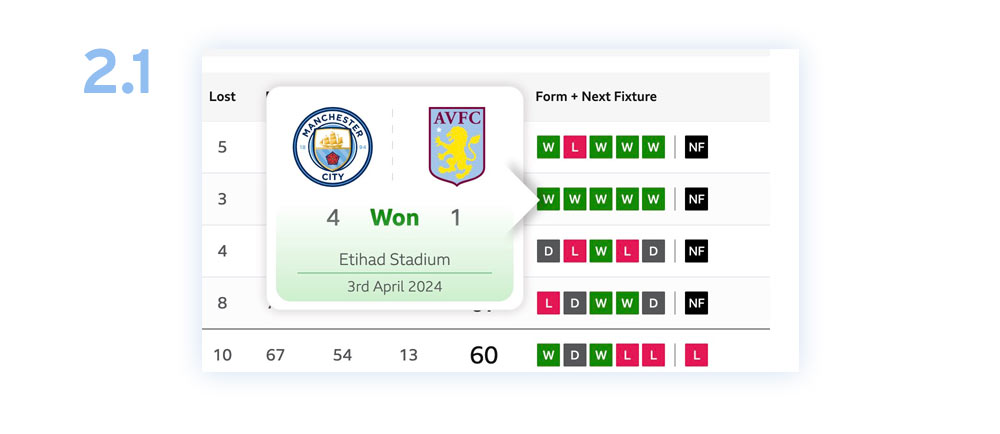
On a previous version of this football table, the BBC had a convenient feature that, upon rollover, shows you details of earlier results. For some reason, they decided to scrap it. Seeing the last 5 results with scores, dates and venues was very useful. I decided to recreate that here using only CSS. It's pretty straightforward CSS, with subtle animations and gradients making all the difference. I think I replaced the last field on the table with a next fixture rollover, which is handy. Check out the demo for the full effect.

#3 Alternative table row highlighting
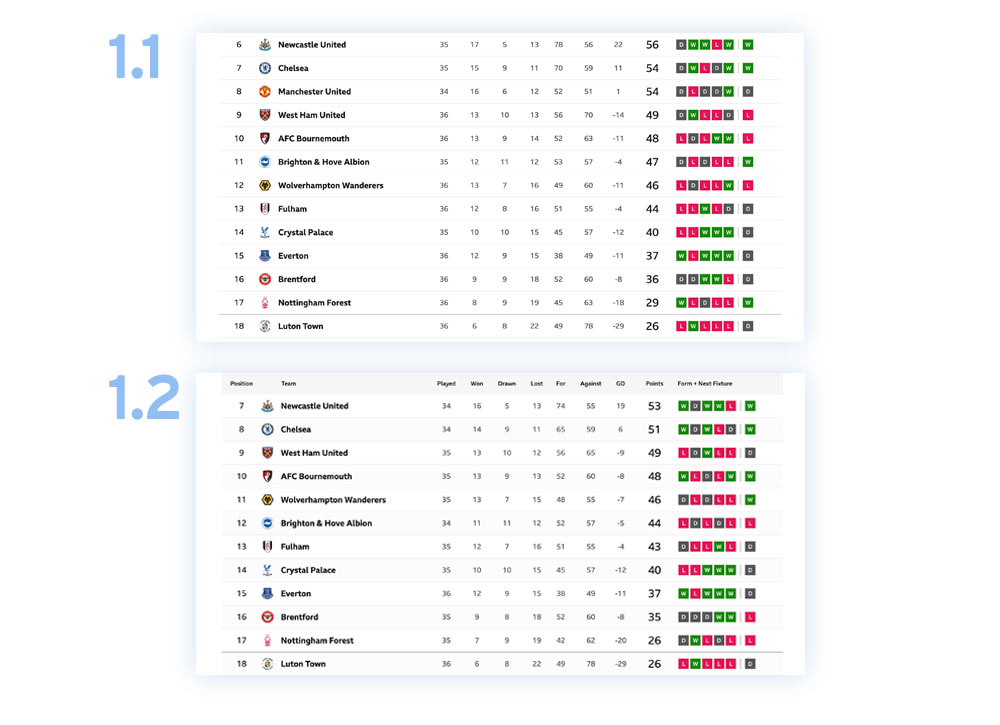
In the 1.1 and 1.2 examples above, you will notice a slight difference in the colour of every second row. I haven't just added this to make it look pretty. There isn't a massive problem with how this table has been designed, but adding a different background helps lead the eye across the data. It allows a little for sure; the idea of an alternating background on the rows is much more effective when there is more data on the screen and it's cramped. In situations with more data, the 'banding' effect helps the user line the content up.
#4 Pages that link to themselves
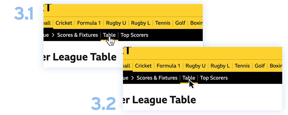
There is no reason why pages should link to themselves. Why would we want to link to the BBC Sports Football table page when we are on the BBC Sports Football table page? It might be something to do with how BBC handles its content in the Content Management System behind the scenes, but in an ideal world, pages shouldn't link to themselves.

You can see in 3.2 above that there is no change in the pointer's appearance when the "Table" is rolled over.
In one line of CSS, we can remove the link interaction:
.property li[aria-current=true] a{ pointer-events: none;}
Technically, there is still a link in the HTML, but this CSS restricts the default pointer event change on rollover.
It's not a deal breaker on a site to have some pages linking to themselves, but these things add up regarding website user experience.
Please see the demo for full live examples of all these areas of improvement.

